About the Project
Bodybuilding.com is an online retailer and publishing platform specializing in sports supplements and fitness content. Their All Access program is a paid subscription service featuring premium workout plans with daily workouts, nutrition guides, and video instruction.
After the initial launch of this program, my team was tasked with evaluating and optimizing the experience and conversion rate. We evaluated the overall user flow, workout plan discovery, and pay wall experience.
My Role
I led the effort to define the problem space and create designs that addressed top issues with workout plan discovery and the subscription sales funnel. I worked with my design and research team as well as a product owner, data analyst, and our development team.
After analyzing the current state of the experience, I presented recommendations to stakeholders, created high fidelity designs and prototypes, and worked closely with engineering and the content team to ensure the proper implementation.
From kickoff to implementation, this project was completed in a three month timeframe.
The Problem
Research and Insights
In order to identify areas of opportunity within All Access, we looked at several key indicators of usability, studied user behavior, and researched freemium best practices:
• In-house data analysis
• User videos
• Competitive analysis
• Heat maps
• Rage click analysis
Current experience evaluation
We discovered that users wanted to view a few workout plans first before making their decision to subscribe to All Access, however, we always hit them with a sales pitch at the outset of the journey. On top of that, the sales page was text heavy and didn’t break down the benefits of All Access effectively.
Once users started browsing plans, they quickly became overwhelmed and confused due to duplicate plan listings, convoluted categorization, and a lack of plan details.
After landing on a workout plan overview page, users were again met with a frustrating experience caused by a clutter UI, lack of detailed information about the workout plan, and insufficient explanation of All Access.
Sales page: Text-heavy with unclear benefits
Find a Plan: Duplicative plan listings

Plan overview: Cluttered yet not enough information
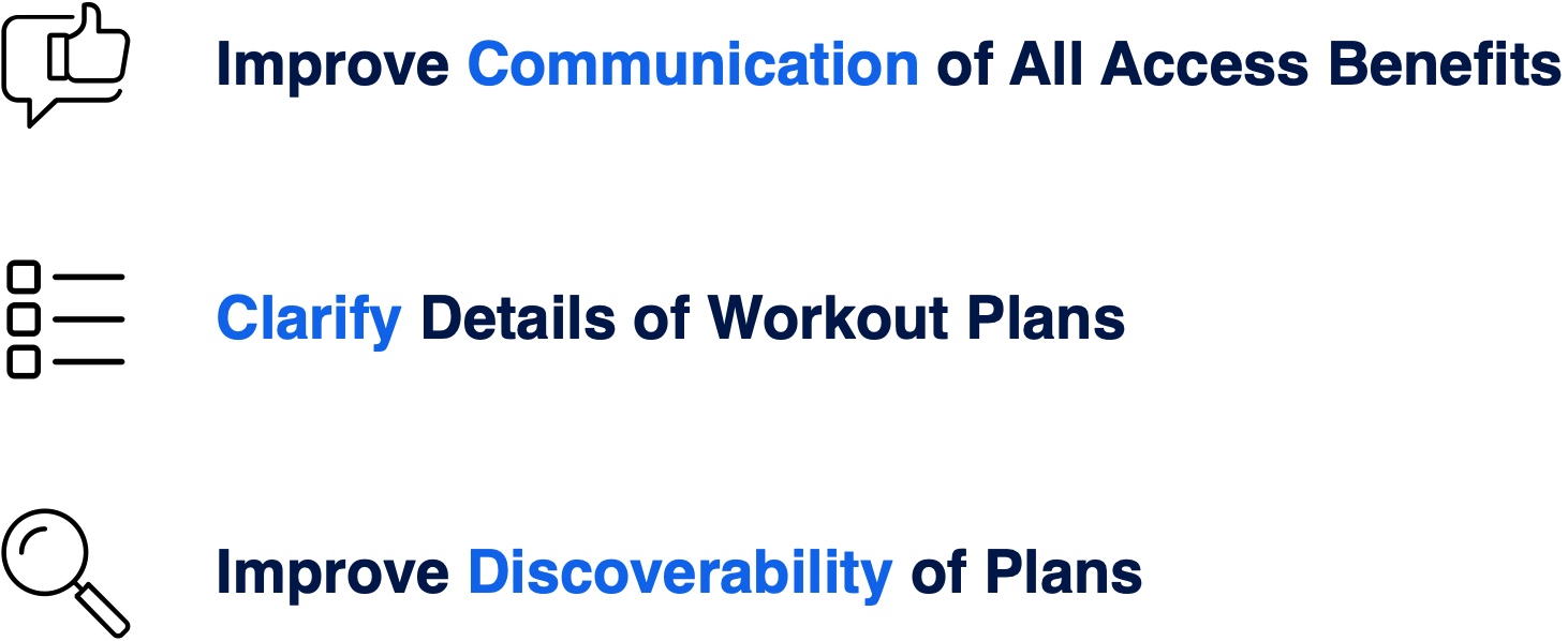
Goals
Despite all the frustration on the overview pages, these pages were still the top drivers of traffic to subscription checkout, however, that traffic was converting at a very low rate. We decided to focus on the following areas:
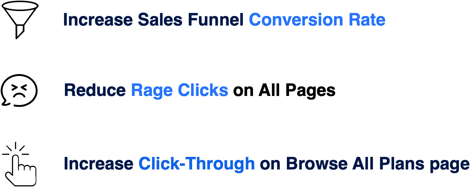
How We Measured Success
What's the point of making a change if you don't know whether or not it made a difference? With that in mind, we decided to use the following performance indicators to determine the success of the project:
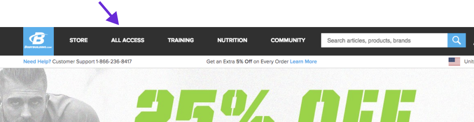
Fixing the Flow
Right away, I could see the user flow needed to be altered to align with our users' desire to browse workout plans first. The All Access link in our primary navigation directed traffic to the All Access sales page when it should guide users to a browsing experience.
Existing User Flow

New User Flow

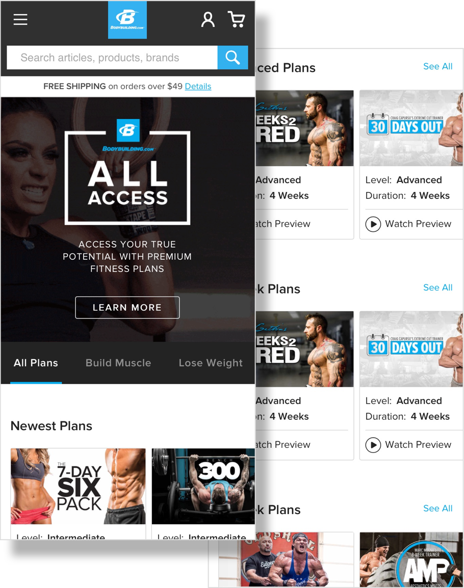
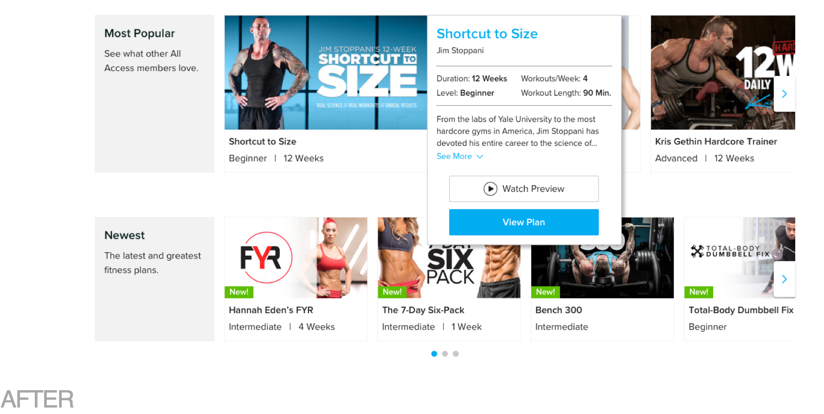
Browsing and Discovery
Improved category headers, plan cards, and carousel functionality. Reduce confusion from duplicate plans

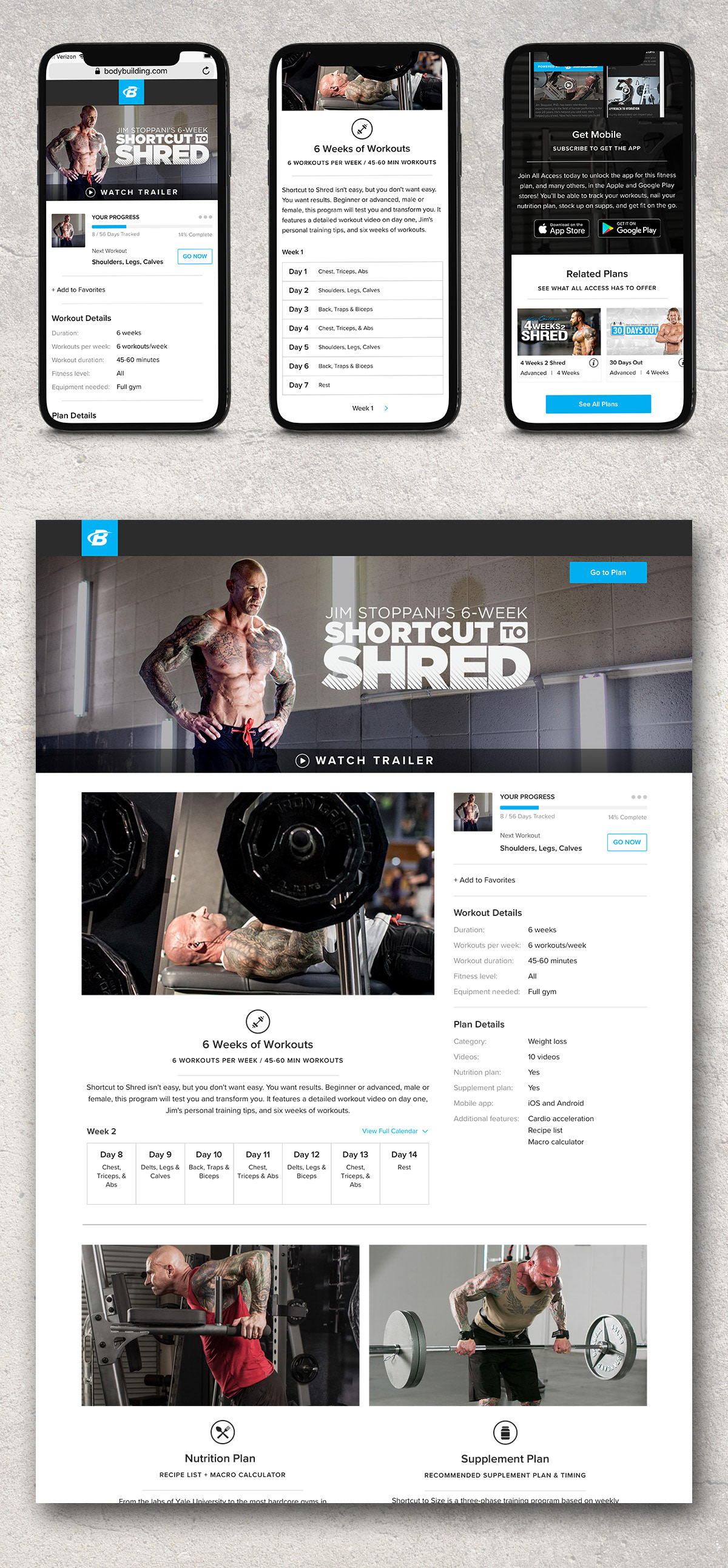
Workout Plan Overview
Users were highly engaged on the plan overviews pages before any updates, however, they encountered one frustration after another. We worked to improve clarity around the benefits of the plan in question as well as All Access in general.
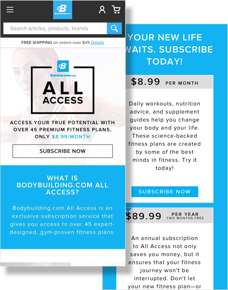
Sales Page
When visiting the All Access sales pages, users are either looking for details about the plans we offer or searching for additional information about All Access as a whole.
By clarifying both of these inquires, we were able to reduce confusion regarding premium plans.
Results
We managed to triple our conversion rate on plan overview pages while also increasing traffic to those pages by 10x! We also reduced rage clicks by 81%.