
About the Project
Bodybuilding.com is an online retailer and publishing platform specializing in sports supplements and fitness content.
Their communication of promotional pricing, final purchase price and cost of shipping throughout their sales funnel was causing confusion for their customers. Promotions that reduced the price of a product were not being reflected in the list price, forcing the customer to do their own math. Additionally, buy one get one promotions often meant that both products were automatically added to the customer's cart without this behavior being clearly communicated.
To top it all off, the order summary in cart was lacking clarification of discounts applied, shipping cost, and estimated order total leading to sticker shock once the user clicked through to checkout.
The objective of this project was to clarify these key points in the sales flow in order to reduce friction and improve the user's purchase experience.
My Role
As the design lead on this project, I worked with one other designer, an information architect, a usability analyst, a product owner, and development team.
I collaborated on research, wireframes, and user testing. I also provided high-fidelity designs along with prototypes.
What Customers Told Us

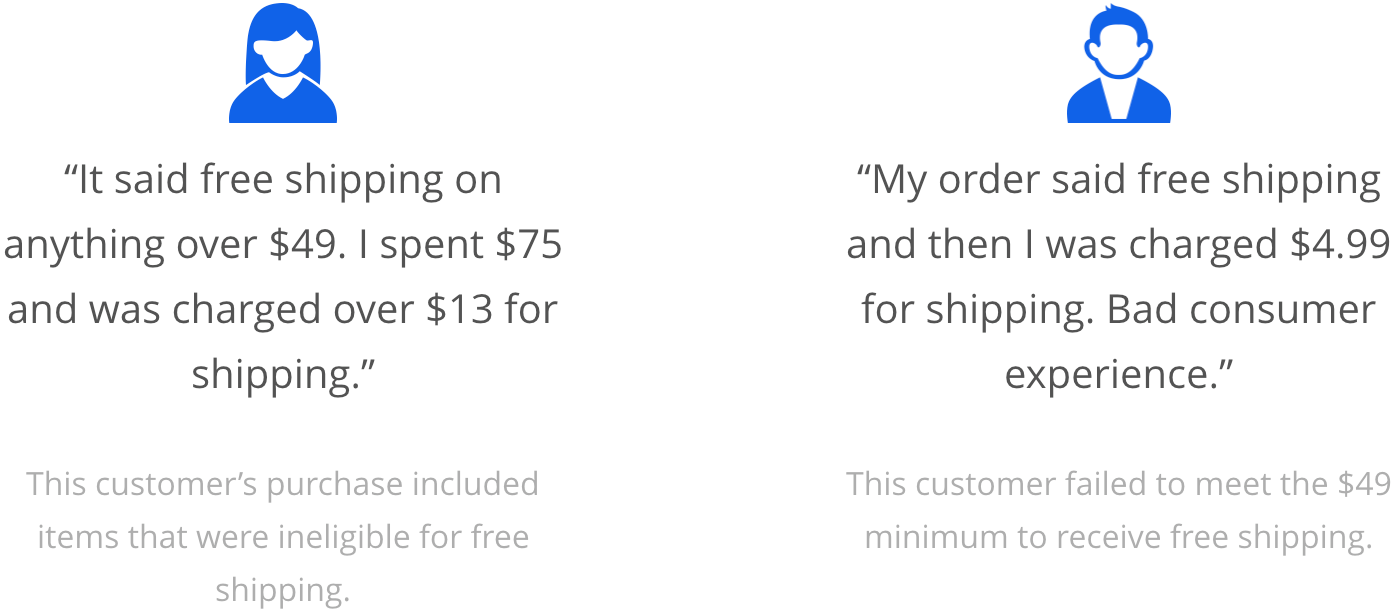
The Problem
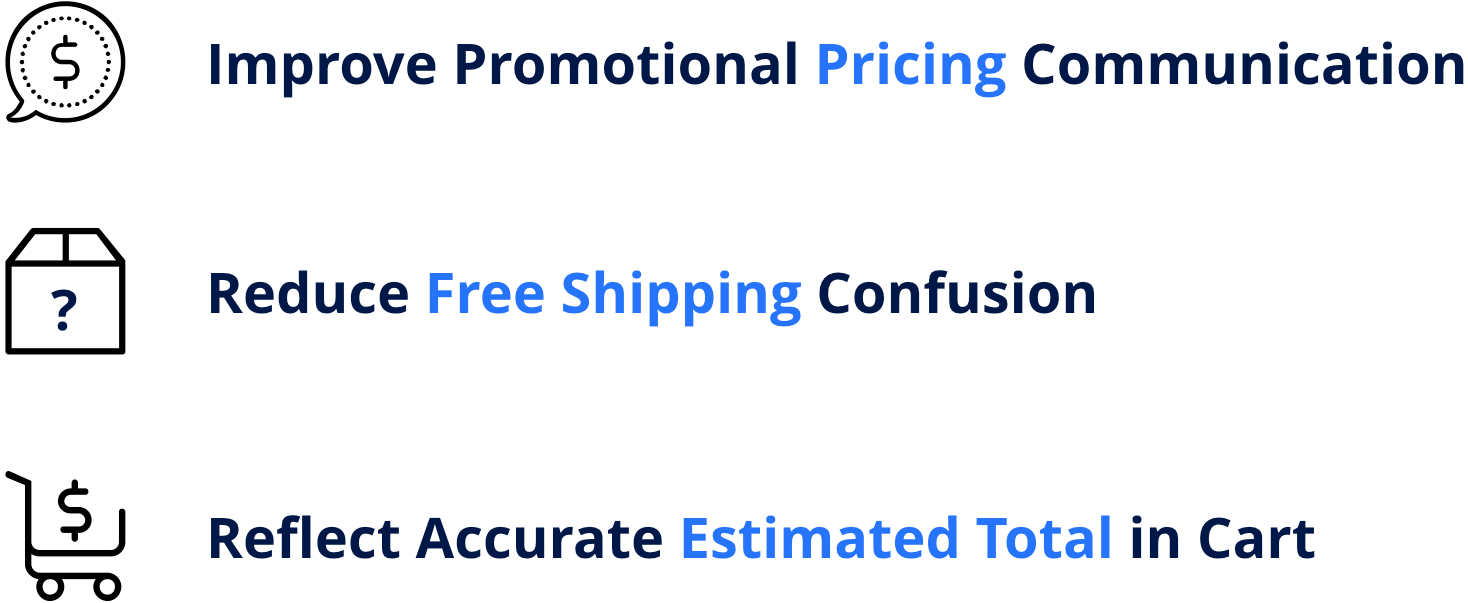
Based on user feedback and other key metrics, we identified three areas in which the breakdown of purchase price communication was the most detrimental to the user's shopping experience. Based on this evaluation, we set forth the following improvement goals:
How We Measured Success
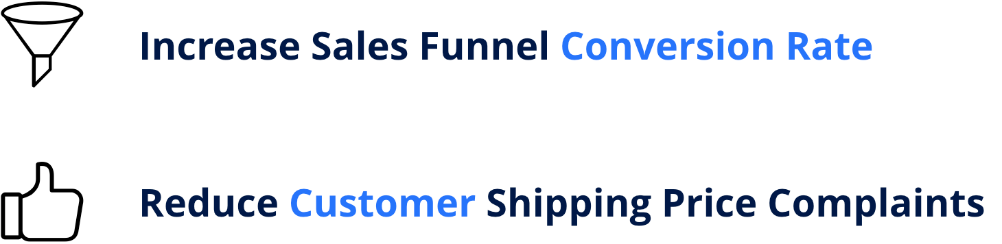
What's the point of making a change if you don't know whether or not it made a difference? With that in mind, we decided to use the following performance indicators to determine the success of the project:
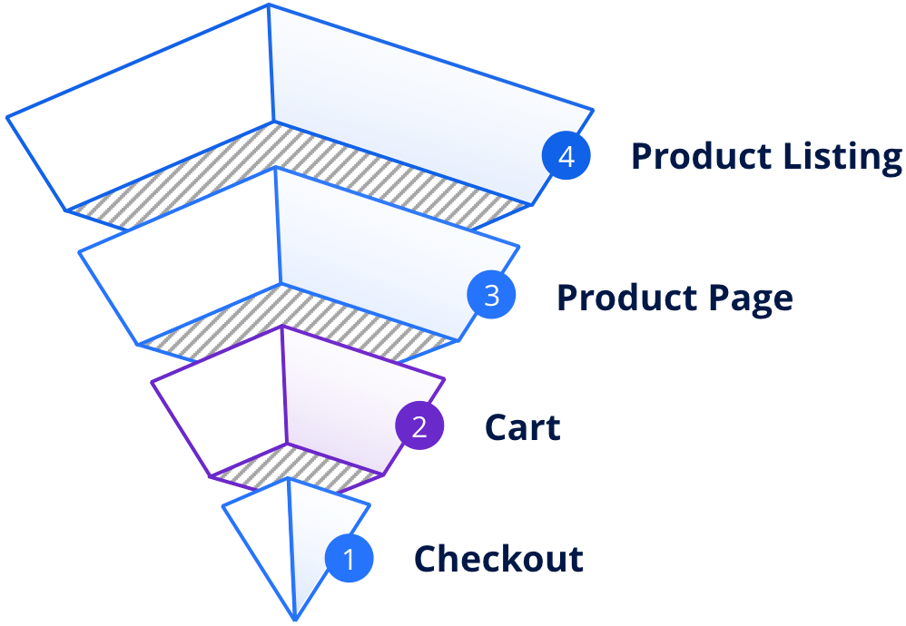
Building Bottom Up
We approached the project from a bottom up perspective in order to impact the customer’s experience in the most meaningful and expedited way. By prioritizing the work in this fashion, users closest to the final purchase decision would see improvements first, thereby potentially retaining customers that would have otherwise exited the funnel.
Analysis and Testing
When first diving into this project, we used several methods to evaluate the current state of the sales flow as well as the best path forward to optimize the experience not only from a user consideration but also in regards to market analysis and recommended best practices:
• In-house data analysis
• 3rd-party usability and best practice reports
• Research and analysis of direct competition and top e-commerce websites
• User videos and heat maps
• On-site A/B testing results
Based on this analysis, we developed several wireframes that underwent user testing with both existing and new customers. The results of these usability and preference tests, along with the other data we collected, clearly informed the high-fidelity designs.
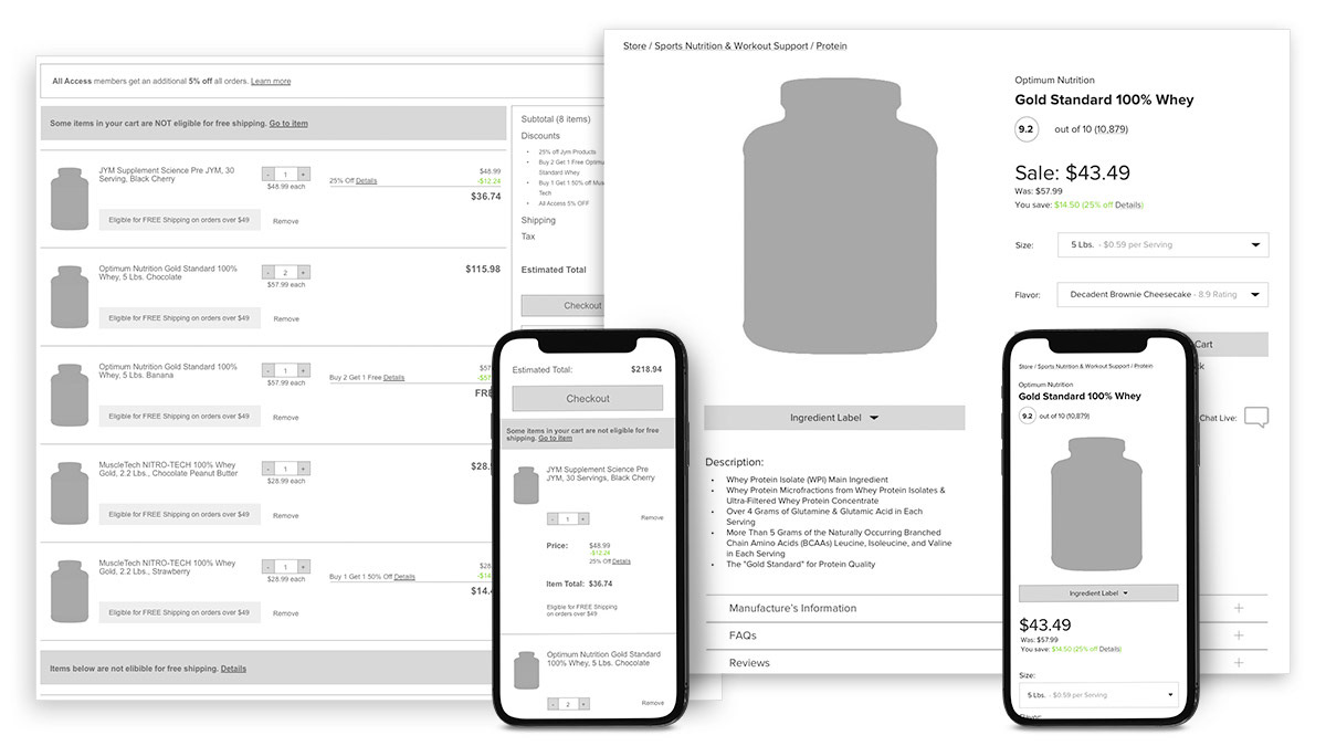
Cart and Checkout
The original cart and checkout was lacking in several crucial areas:
• Unclear communication of discounts
• Lack of estimated total
• Visually redundant and misleading free shipping messaging
• Product blocks that were difficult to scan
• Lack of estimated total
• Visually redundant and misleading free shipping messaging
• Product blocks that were difficult to scan
In order to alleviate these issues, we focused on providing a more detailed order summary, clarifying the calculation of discounts, and clearly segmenting products that are ineligible for free shipping.
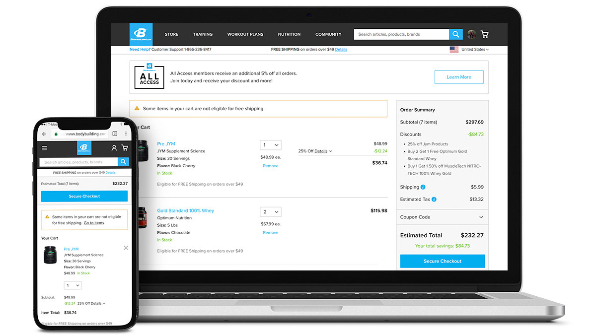
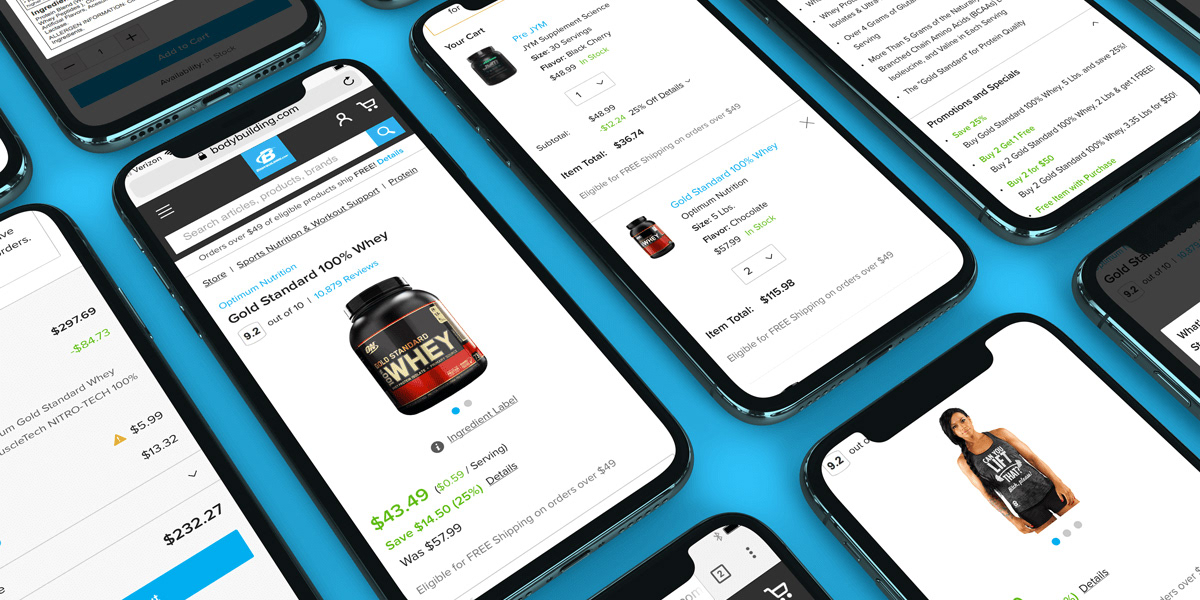
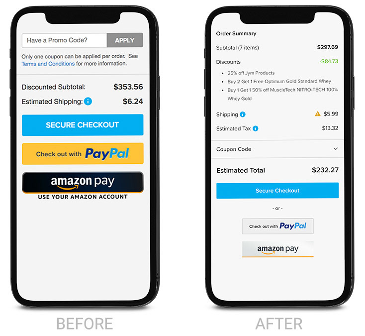
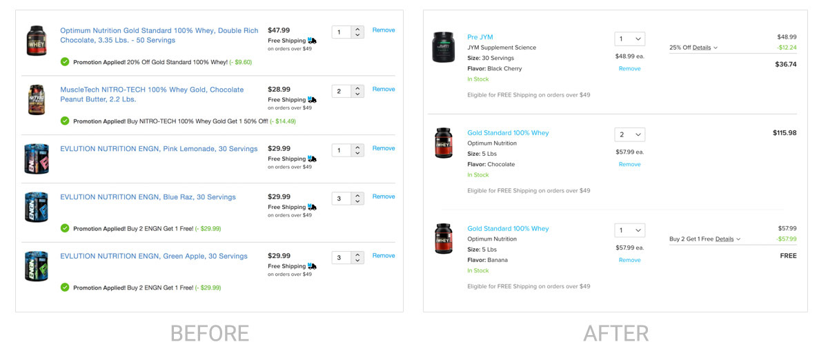
Order Summary
The user’s order summary was not displaying enough detail and was clearly missing estimated tax, total discounts, and estimated order total. On top of that, the primary CTA was getting lost amongst other payment buttons.
Through testing, we found that users prefer to see an itemized breakdown of their savings while also seeing total savings. Additionally, the user’s total price at checkout is more clear and the "Secure Checkout" button is placed in the proper hierarchy.
Product Blocks
The revision of the product blocks allowed us to display promotional savings in a clear mathematical way which resonated well with users in testing. Additionally, products that share a promotion (buy one get one) are placed in close proximity to each other grouped together visually.
We've also formatted product information in such a way that makes it easier to scan
Product Page
The original product pages had a disjointed designs across desktop and mobile, with desktop being an exceptionally poor experience. With the execution of this project, we were able to improve the product pages in the following ways:
• Unified desktop and mobile experiences
• Product Overview is bulleted and easier to scan
• A complete list of all promotions available was added
• Actual purchase price is clarified and highlighted in green
• “Was” and “You Save” totals further highlight savings
• Ingredient label was moved to a more intuitive location
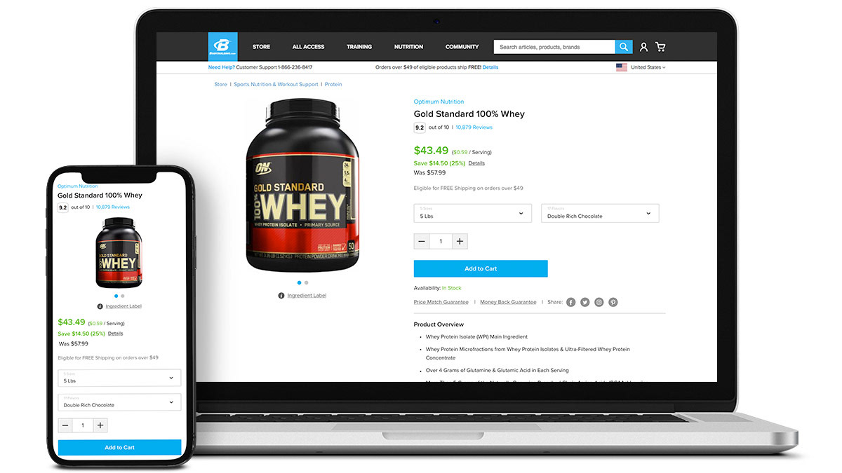
• Quantity of CTAs on desktop has been reduced to one primary “Add to Cart” button
• Double dropdown selectors were added and include all pricing and promotional information as well as flavor rating
• Messy vendor block is collapsed in order to reduce clutter and unify all product pages visually
• Reviews, Product Details, Directions, and FAQs are presented via tabs in desktop and accordion in mobile in order to make that information more visible and readily available

Results
As of May 2018, we’ve seen significant improvements in key success metrics.
With only a quarter of the overall project in production, continued improvement is expected upon completion.
